Unique Content - unique, individual and high quality content. You can find out what this is all about here with us! ... Continue reading


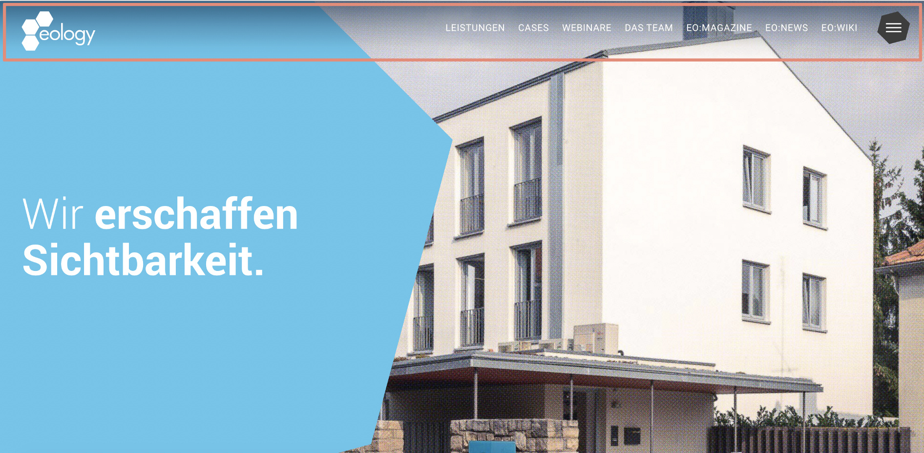
A header is the visible area at the top of a web page. It is an integral part of the website structure and provides the user with basic, essential information. As a rule, it contains important and frequently used navigation points and elements such as “Login” or “Help” in addition to the site’s logo. A header is designed the same for all pages across domains. It is located above the actual main menu or includes it.
But what is the header of a website for? An important function of this website element is to help visitors navigate, find their way around and interact within the site. By the way, the header is the counterpart of the footer, which is located at the very end of the web page.
Example:

This is what the header of the Apple website looks like: In addition to the logo on the left, you’ll find important navigation items here, as well as the option to access the full main menu (far right via the honeycomb). In web shops, the shopping cart is usually part of this as well. This makes sense, because the header remains identical on all subpages. This way, the user can access his saved products at any time, no matter in which category he is browsing products. The same applies to the search field, which is also accessible on all subpages via the header.
By the way, a header is not only used to refer to the header area of a website. Emails also have a so-called header. This email header contains important information about the message – for example, the sender, recipient and creation date.
Attention: people often confuse the HTML header element <header>, which is used to integrate the header on a web page, with the element <head>. However, they are different elements with different functions!
HTML element <header>: Describes the visible header area of an HTML document. It contains a group of introduction and navigation aids, as well as header elements such as logo, search box, etc. … The content of the HTML5 header element is visible for you, e.g. when you call a web page.
HTML element <head>: Meta tags are used to store meta data for the corresponding web page. These are only visible when you look into the source code of the HTML document. So you don’t see them at first sight when you open a page.
The header is the first thing you see when you open a website. It is its business card, so to speak. To make a good impression, you should pay a lot of attention to the design and function of the header. On the one hand, you should provide the user with basic information, because here he has it immediately in view when calling up the above-the-fold area of the website. On the other hand, you should not overdo it with the amount of information. A clear and concise website header is more appealing to users than a completely cluttered one. For further navigation points there is the main menu. The header should not distract from the main menu!
When designing the header, you should follow common usability standards. The user should be able to find the elements he is looking for quickly. In addition, they should also be in the place where he expects them. Therefore, some guidelines have evolved in the design to make the use and navigation of the website as easy and intuitive as possible.
Useful links that help the user navigate are also:
Olga Fedukov completed her studies in Media Management at the University of Applied Sciences Würzburg. In eology's marketing team, she is responsible for the comprehensive promotion of the agency across various channels. Furthermore, she takes charge of planning and coordinating the content section on the website as well as eology's webinars.
You want to learn more about exciting topics?
